Project: HSBC Account alerts
A solution for staff to manage customers' account alerts.
Problem
Not all of HSBC's customers bank digitally and because of this, they can't manage their SMS account alerts online.
There was an existing solution for staff to update alerts for customers but they could only turn all of them on or off- there wasn't room for customization.
Not only was an updated solution needed to better service customers, but also to adhere to a new Canadian government bill.
Who
The users were branch and contact centre staff who service customers.
Goals
The main goal was to create a solution for staff to update custom account alerts for customers on a new staff facing application. With both the staff and customer in mind, the general, secondary goals were to make the application intuitive, efficient, and consistent. These would help to create an easy and painless experience to help reduce stress, and time spent servicing the customer.
My role
I was the lead UX designer: I gathered requirements, conducted comparative analysis, built wireframes, produced the user flow, created the high fidelity designs and copy, defined the interaction design, conducted user testing and tested the built product against the design documents.
Requirements gathering
Meeting with the stakeholders, I learned about the problem and reviewed the requirements that needed to be included in the solution (including alert types, validation rules and customer data to be displayed). While recording requirements, I also note any preliminary ideas I have to make the experience better. In this case, I recommended displaying extra account information to inform the staff of data such as current balance, limits and available credit so they would know if the alerts they've set up fit within those limits.
Research
Through comparative analysis I reviewed other banking applications to view their alert management solutions.
The applications I evaluated were customer facing, which meant the copy and experience would be different, however it was helpful to see how the alerts were organized, toggled and saved.
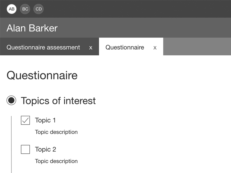
Wireframes
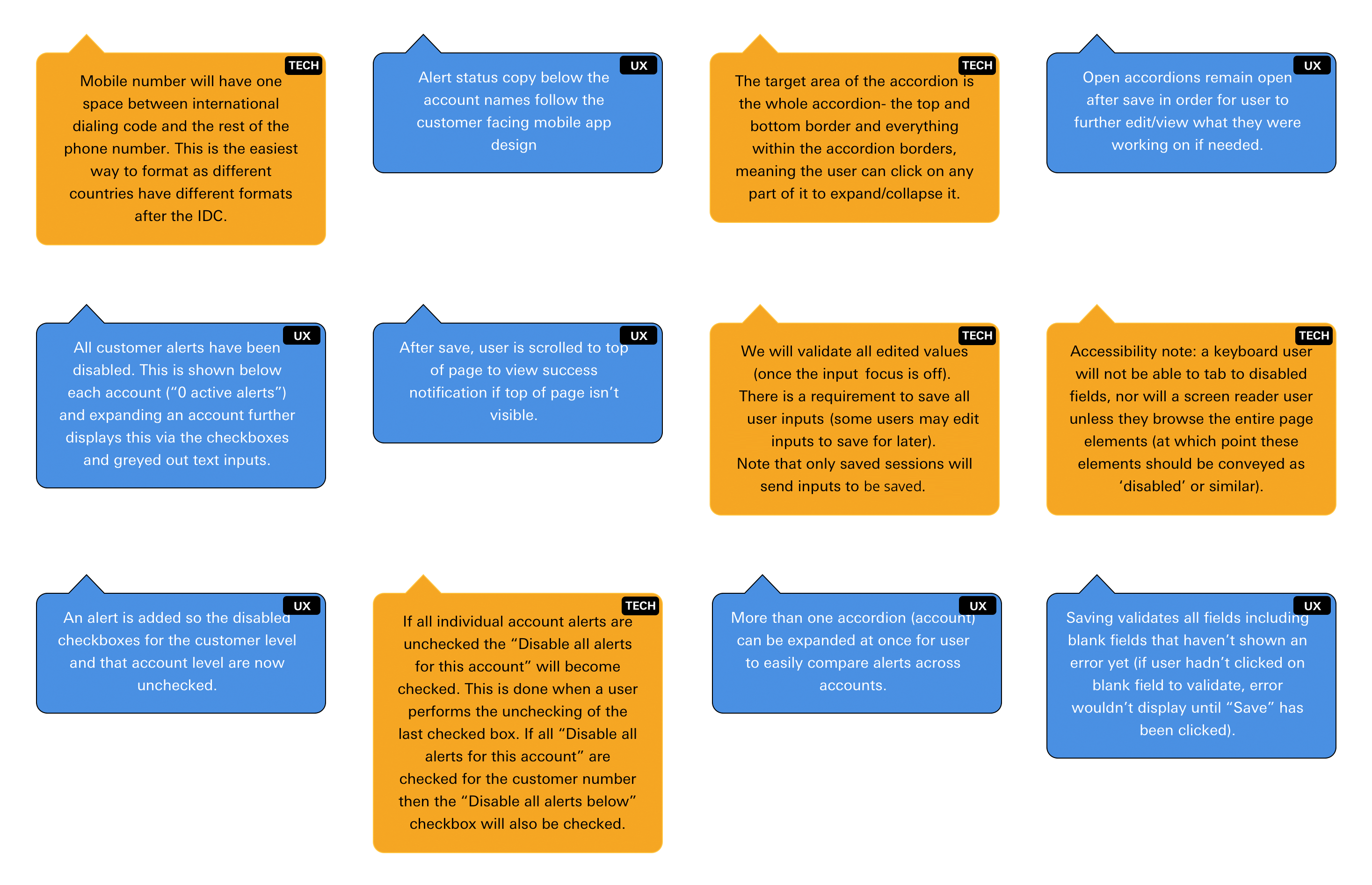
In the wireframes, I included the relevant customer information at the top to help reassure the staff member that they're servicing the right customer as they started the customer journey in a separate HSBC app. Below that is an option to disable all of the alerts- a quick and easy way for staff to do so if the customer requests it.
The accounts are below with account information (to help the staff member quickly locate the appropriate account) and relevant alerts (a savings account will have different alerts than a GIC (Guaranteed Investment Certificates) account). The user can disable all the alerts for that particular account if the customer requests- options like this allows the staff member to quickly and easily serve the customer.
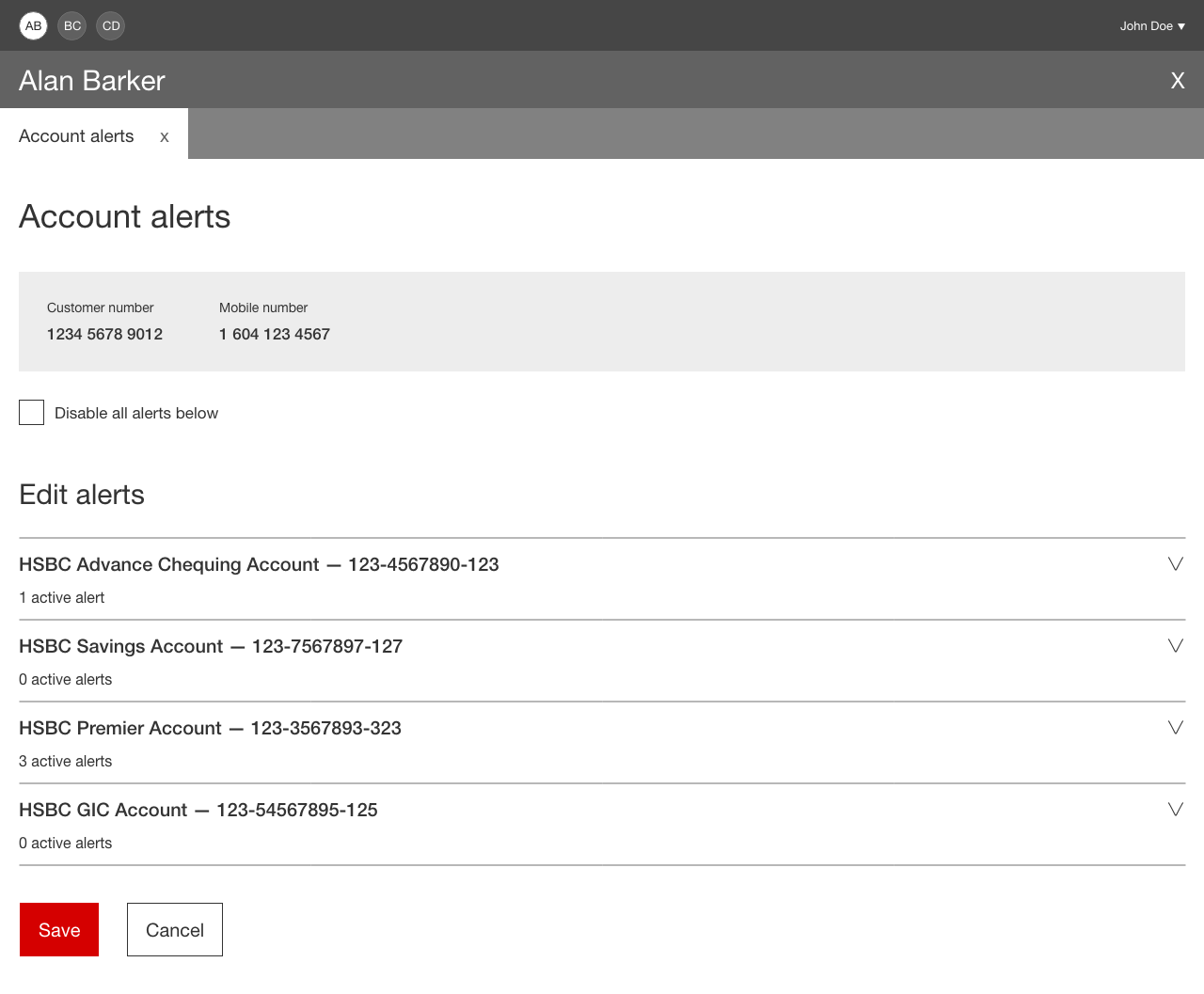
The accounts are in an accordion so that they can easily be expanded for quick access to an account's alerts or be collapsed for a quick bird's eye view of all the accounts.
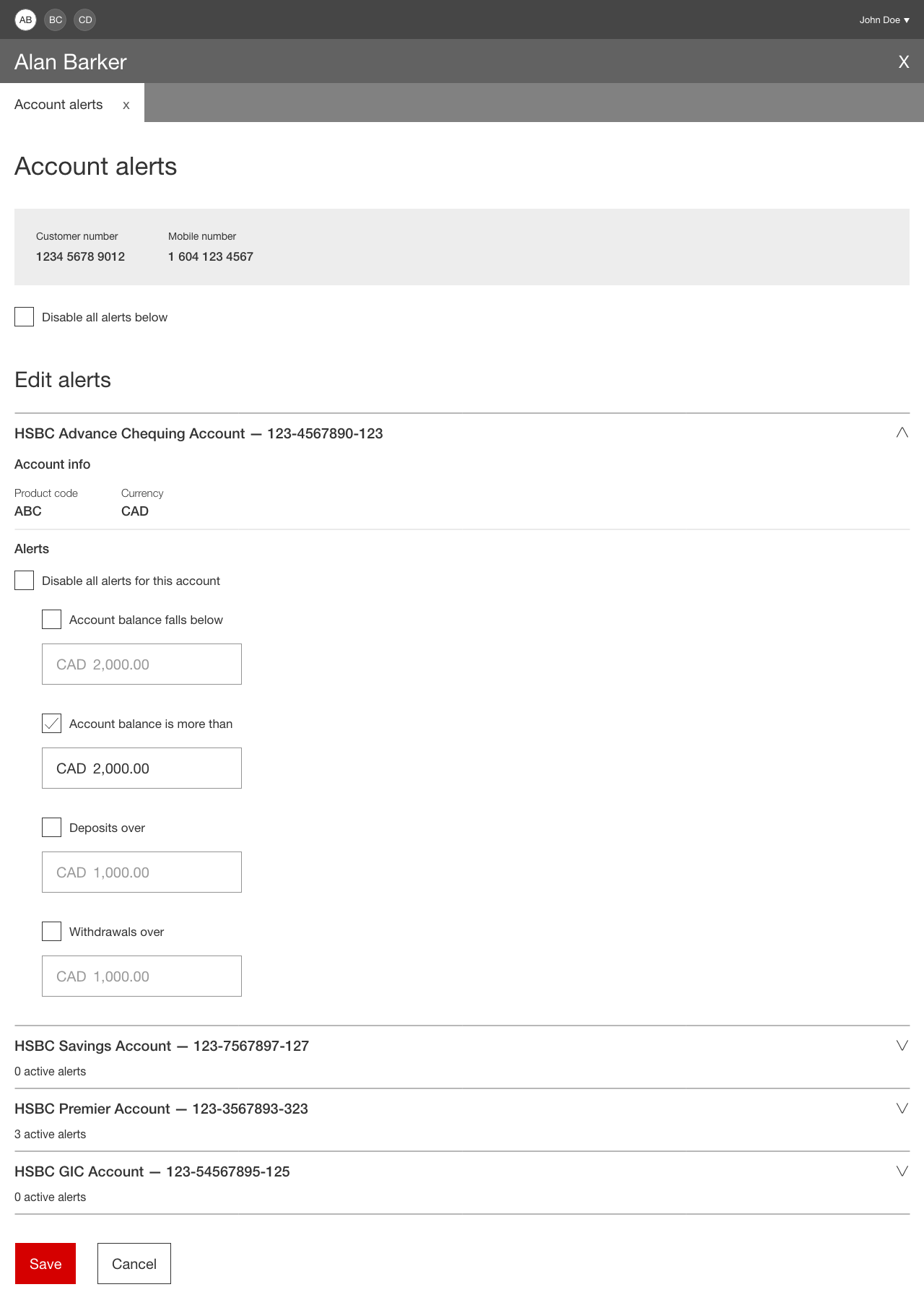
Below each account name, the number of active alerts are shown. This reflects the design on the customer facing app and also allows the user to see if there are any active alerts without needing to expand the section.
The user can save or cancel their changes at the bottom of the page.
Design
While working on the designs, I wrote copy based on the alerts settings in the customer facing app (so that the customer can easily communicate questions they may have about specific sections with no confusion to the staff member). I also ensured that the copy was as intuitive as possible and confirmed this by reviewing it with SMEs.
All of the components I used in the designs are from our common design toolkit. This ensures that our solutions are consistent, on brand and accessible. Once my designs were complete, I presented them to my design colleagues in China for a peer review to ensure that I've designed the best solution and that it's consistent with the projects that they're working on.
As this is an internal app, I am not able to share the high fidelity designs.
Tech and business walkthrough
I worked very closely with the development team to ensure everything I designed was technically feasible. I walked the team through the flow, answering questions and capturing feedback.
Originally the "Save" button was disabled unless changes had been made. This was to assist the user in knowing whether or not they had made changes without clicking on the button. I learned there were technical constraints with constantly checking if there were any changes, so I changed the button to always be enabled. This had to be done in order for the development team to complete the project on time.
There were also issues with certain data not being available so I adjusted my designs accordingly. For technically impossible issues there were no other options but to change them. For issues that were simply technically difficult, I measured that feedback against the potential user and business gain.
I also worked with the development team to obtain a list of all possible system and user errors. I created new copy and designs for errors that didn't fit with any existing patterns.
In the walkthrough, I shared the experience annotations which I documented in the user flow for the team to easily reference during development.
I worked with the business team, walking them through the flow and answering any user experience questions.
Usability testing
Time and access to users was limited, however I had the opportunity to do usability testing with an SME with over 15 years experience in a branch role.
Before the session I wrote a test script which introduced the feature, asked background questions about the user, provided usability tasks and asked questions regarding satisfaction.
In the session, I learned about the customer's role, background, work duty details and device set up. This particular user had a set up of two external monitors and a wireless mouse and keyboard. They used a mouse to navigate applications.
I walked the user through tasks (both "happy" tasks and tasks that produced errors) while my colleague recorded their reactions and feedback. After each task I would ask questions such as "What do you think of this flow?", "Is it helpful/useful for your daily work?", "Is it smooth?", "Do you have any comments?" as well as asking for a rating based on their satisfaction and what worked well and what didn't.
Positive feedback from the user included:
- Screens are user friendly
- Screens are self explanatory
- Errors are specific
- Liked the clickable errors at the top of the page that navigated directly to the field with the error
- Liked that the error appeared in the collapsed accordion headers as well
- Liked the one click disable checkboxes
- Liked the big font
- Liked that the sections are collapsible
The user had one piece of constructive feedback- they wished it was easier to get to the save button for customers that had a lot of accounts, when many account sections were expanded. I imagine this will either get fixed with experience- the user may get used to scrolling, collapsing sections, or using the "page down" key. If this was a common issue, we could add functionality to either collapse all sections, or have a "Scroll to save" link floating on the right side of the page. Because of timelines and only having tested with one user, I saved this feedback for the future when there will be an opportunity to test with more users and make more development changes.
Because we didn't have the opportunity to get more user feedback at that time I asked that user (who works with branch staff), their opinion on ease of use for other staff members of different technical abilities. They shared that they thought it would be great for others as it was intuitive to them. This question wasn't a preferred medium of feedback but sometimes it's good to get a possible gauge when possible.
QA testing
After the feature was built, I tested it, ensuring the visual and interactive elements were correctly implemented. Upon discovering defects I logged them in Jira and prioritized them based on the defect type (visual or functional) and their severity. This was to help both developers and business know the importance of each defect as timelines were tight and not all defects could be fixed for the first release.
Release
The feature was released to a limited number of users for one week as a trial before being released to the live application. No user experience complaints have come back from the release and I look forward to future usability testing to ensure user satisfaction. The goals were met: we created a user friendly solution for staff to edit and update customized account alerts for customers on the new staff facing application.
Digital energy bills
ScottishPower
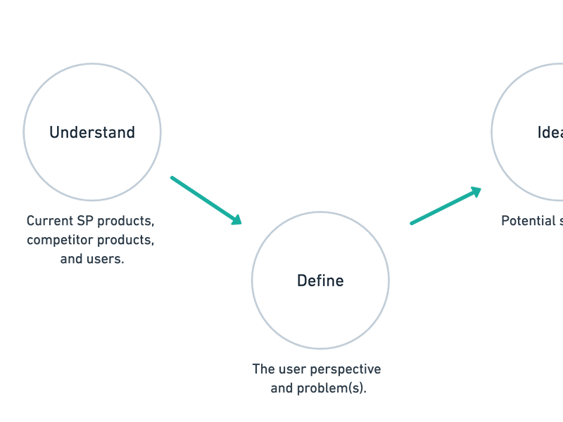
UX process
ScottishPower