Project: Speakbox app analysis
Speakbox is a mental health app allowing users to self-manage through journal entries and mood tracking as well as connecting with care providers to share session notes and more.
Problem
As a UX consultant I analyzed all of Speakbox’s products (SB Care web app, SB web app and SB mobile app). Working on a tight timeline, I used both my experience and UX design principles as lenses. The audience to consider are those looking for mental health help and education.
Feedback
The following is primarily mobile app feedback tested against usability heuristics.
Help and documentation: new users may struggle with the value of the app and its features.
Solution: implement interactive onboarding.
Consistency and standards: most of the grey and green text doesn’t pass contrast ratio guidelines and needs to be fixed.
Solution: adjust the colours to pass the contrast ratio guidelines.
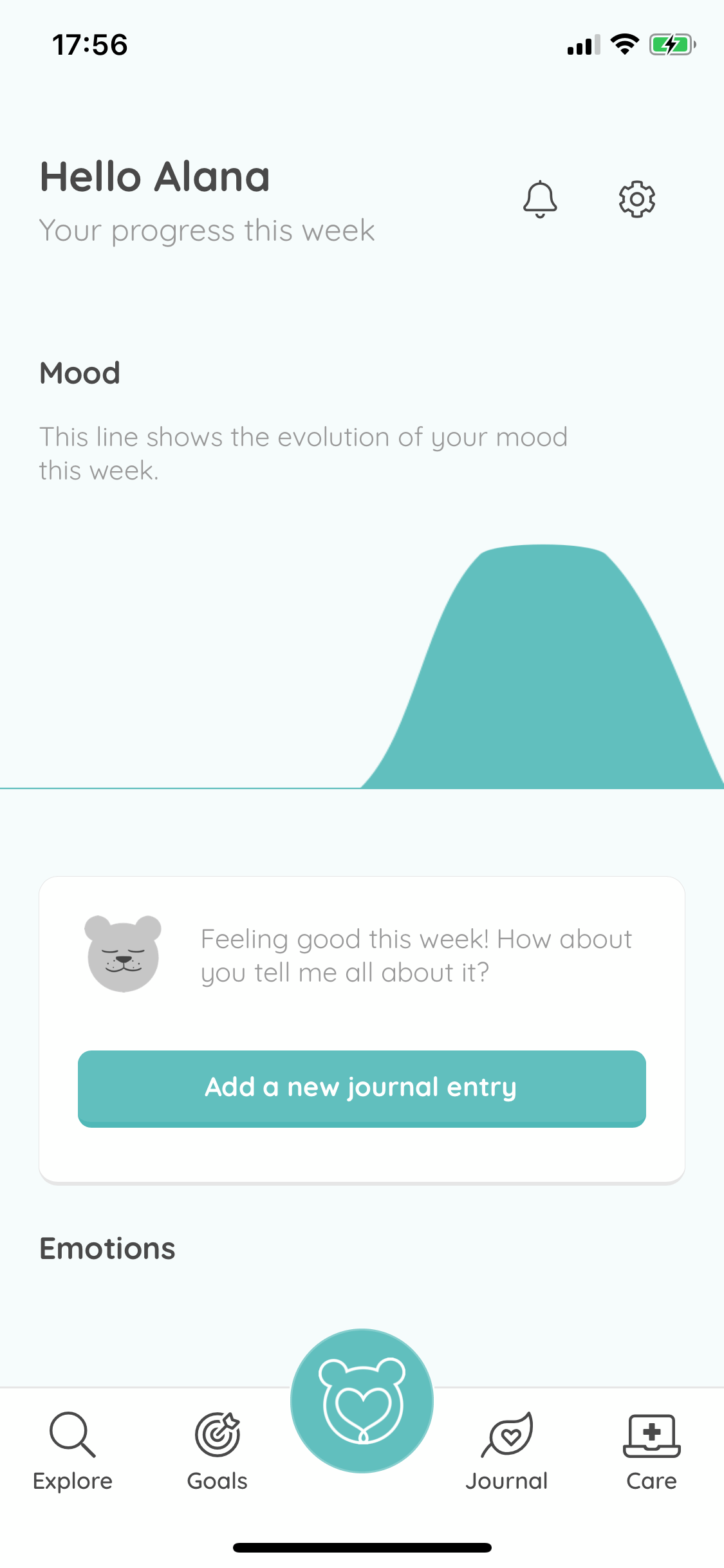
Consistency and standards: the bottom middle navigation item looks like a quick action button but is a home button which may be confusing for users.
Solution: remove this button and create a home button on the left with a house icon.
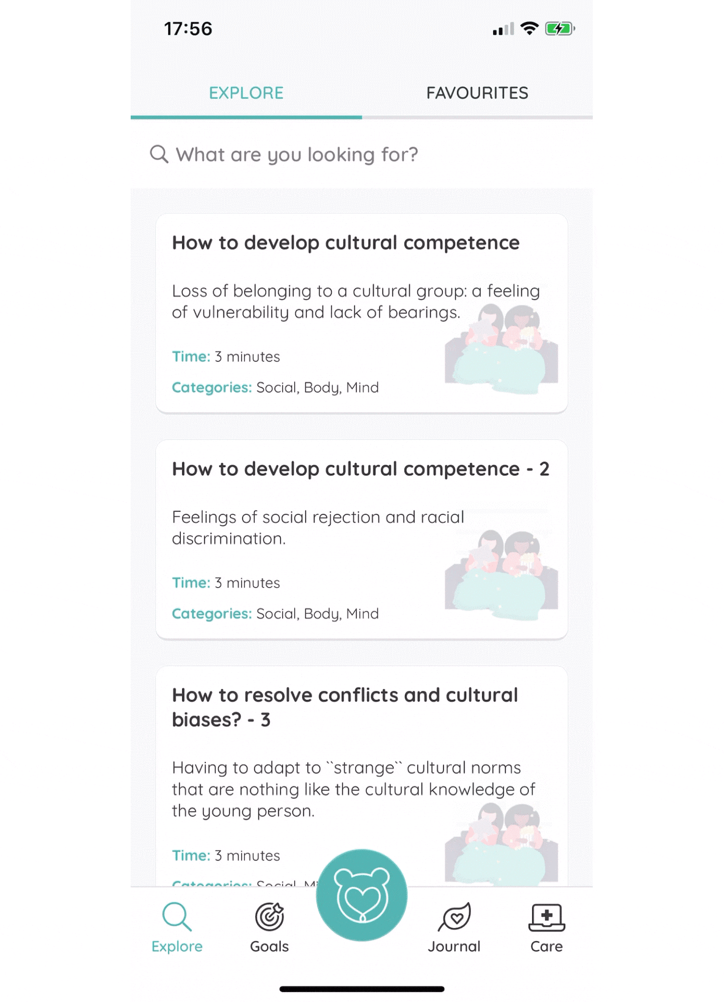
Flexibility and efficiency of use: the explore section has content that could be useful to the user but it is hard to easily find specific content or even browse. This is because it’s a large list and the search functionality doesn’t work as intended.
Solution: put content into categories that are easily browsable and fix the search functionality to display accurate results.
User control and freedom: you can log activities but you can’t undo the action. If the user didn’t mean to log the activity, they have no way of removing it.
Solution: allow the logged activities to be editable and incorporate an “undo log” link or button.

Consistency and standards: the tags look like buttons and thus, clickable.
Solution: change the style or make them clickable.
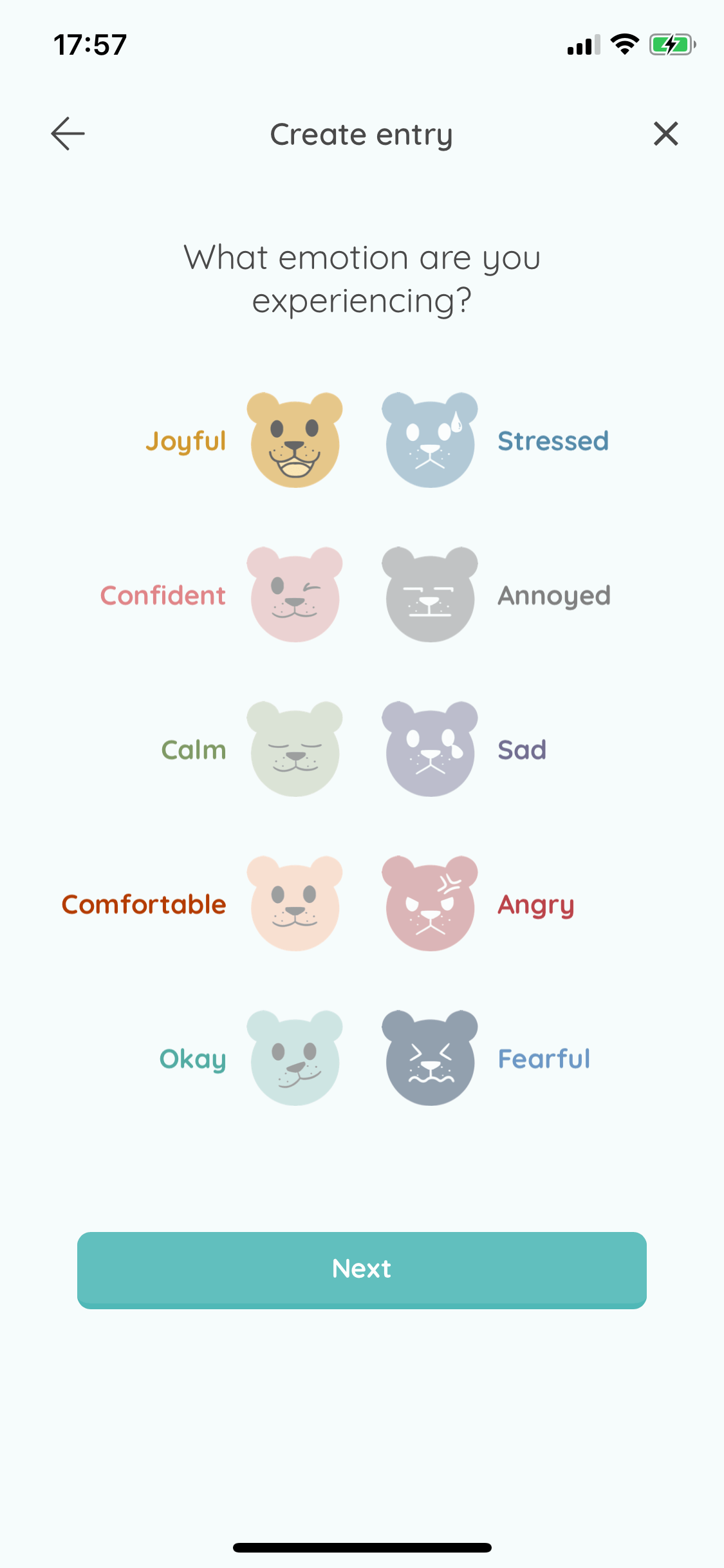
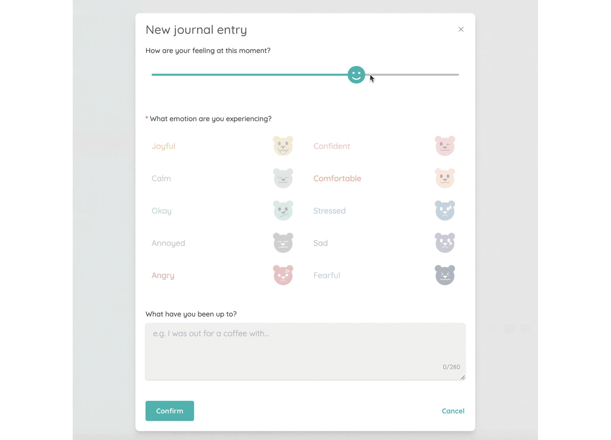
Help and documentation: when choosing emotions to attach to a journal entry, the user has no way of knowing that they can click multiple emotions (aside from trying to click on more than one).
Solution: change the copy to “emotion(s)”.
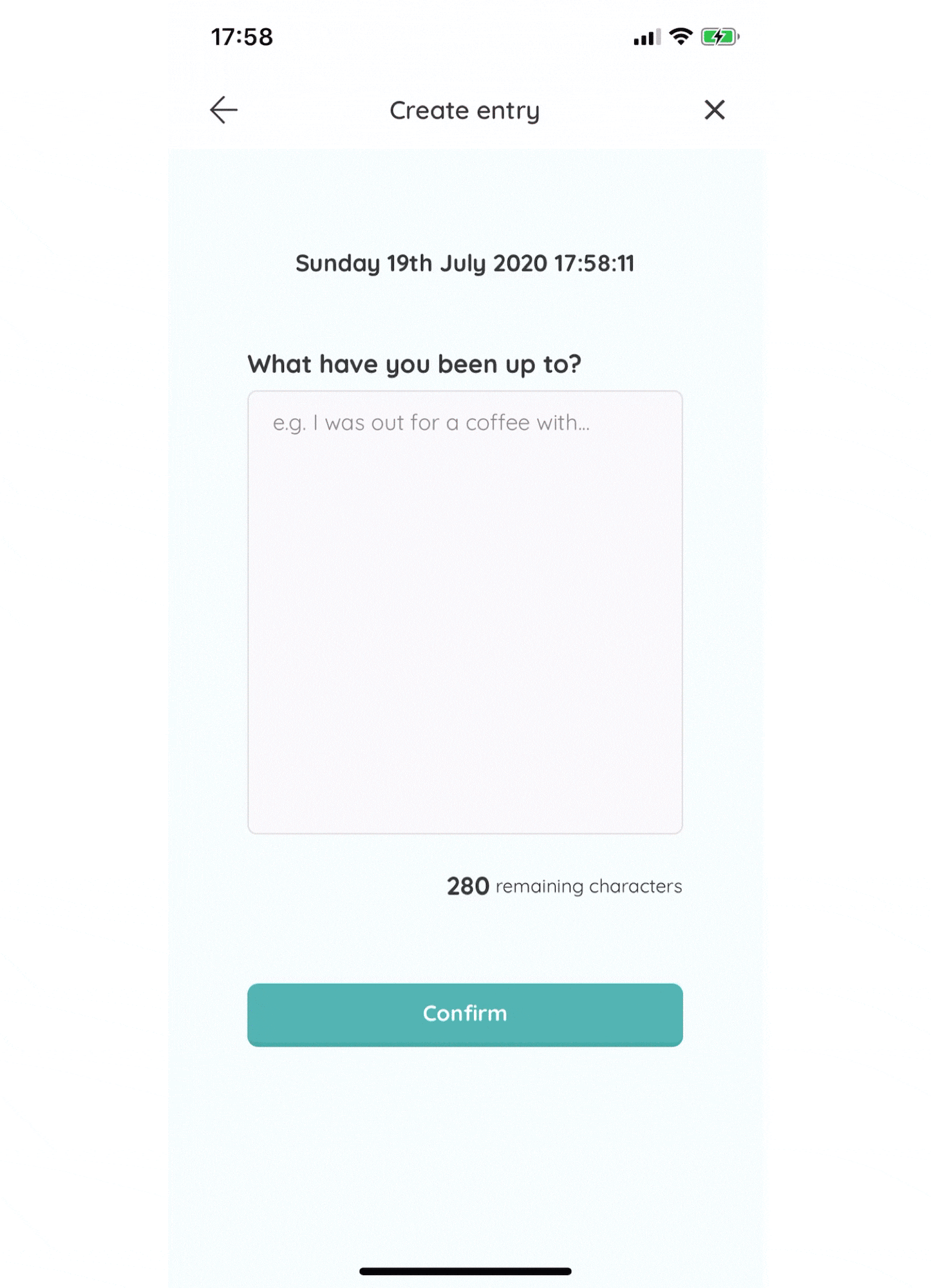
Visibility of system status: when creating a journal entry, there’s a character count below the input box. When you click on the box to type, the keyboard comes up and covers the character count box.
Solution: decrease the height of the input box.
Aesthetic and minimal design: there is a clock at the top of the journal entry page that displays the seconds. The audience in this space could be anxious and this could increase anxiety.
Solution: show the time in hours and minutes only.
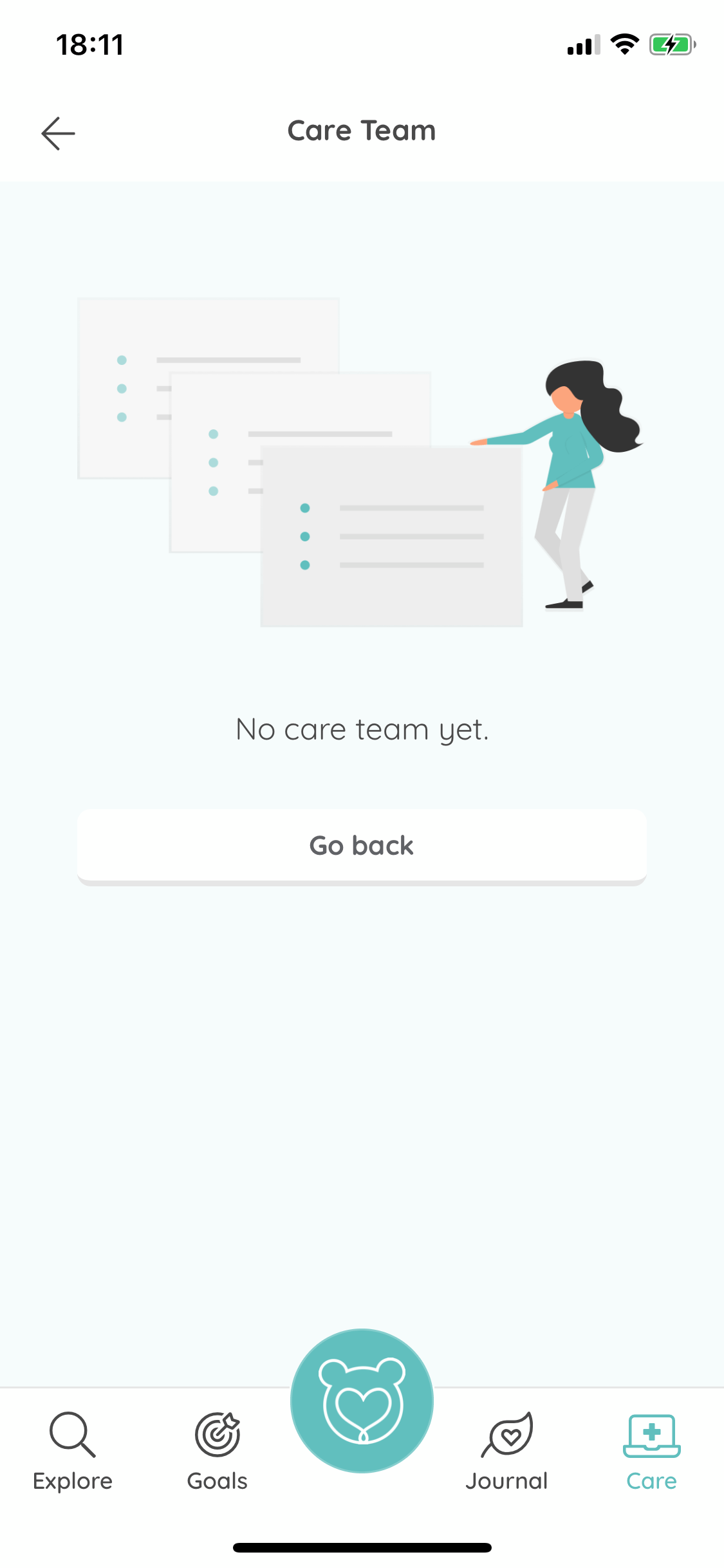
Help and documentation: for any pages with no data on it yet, the copy supplied doesn’t tell the user how to use that page or how to get data.
Solution: tell the user what the page is for and create a call to action to get them started.
Help and documentation: when creating a new journal entry in the web app, if you click out of the modal there’s no prompt warning the user that clicking away will cancel the entry.
Solution: when a user clicks outside of the modal, display a warning telling them that they have unsaved changes and give them the opportunity to continue editing.

Roommate app
ScottishPower
ATB Online website
ATB Financial